Frituur Op Den Dries
A new identity told through comics
Branding and illustration by Monica Carvalho
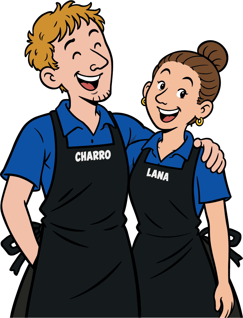
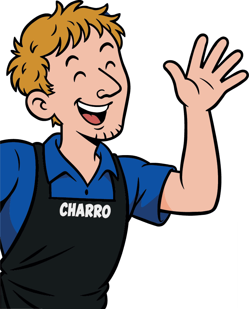
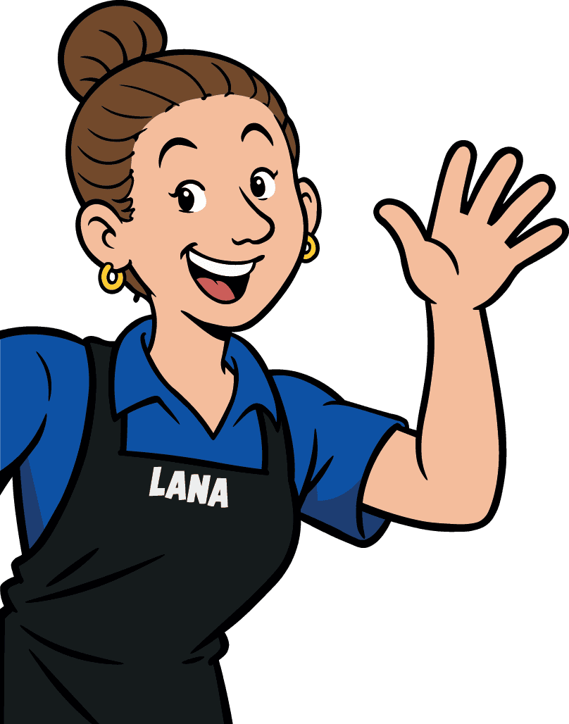
The takeover of Frituur Op Den Dries in Sombeke was an opportunity to give the shop a new visual identity. Together with the new owners, AniDev created a look built around two cartoon characters and the little stories they tell.
View the designs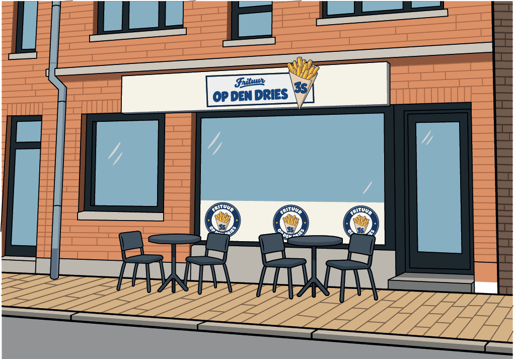
- Client
- Frituur Op Den Dries
- Project scope
- Visual identity, illustration, print, and storefront signage
Project overview
A recognisable new look
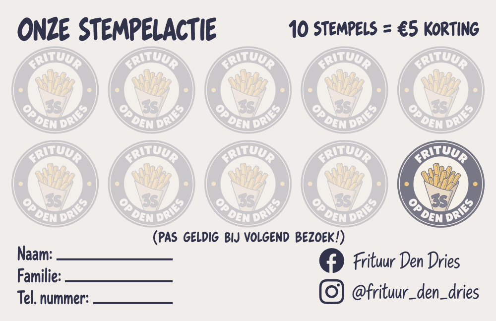
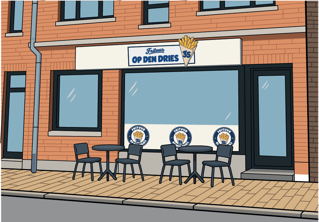
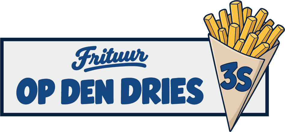
We developed a horizontal wordmark and a round logo around an illustrated cone of fries. We carried the identity through to posters, stamp cards, and the sign above the storefront.
Charro and Lana give each design a story
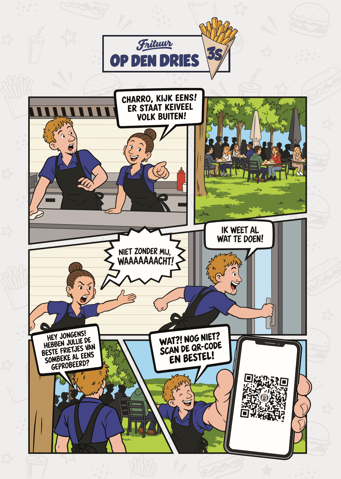
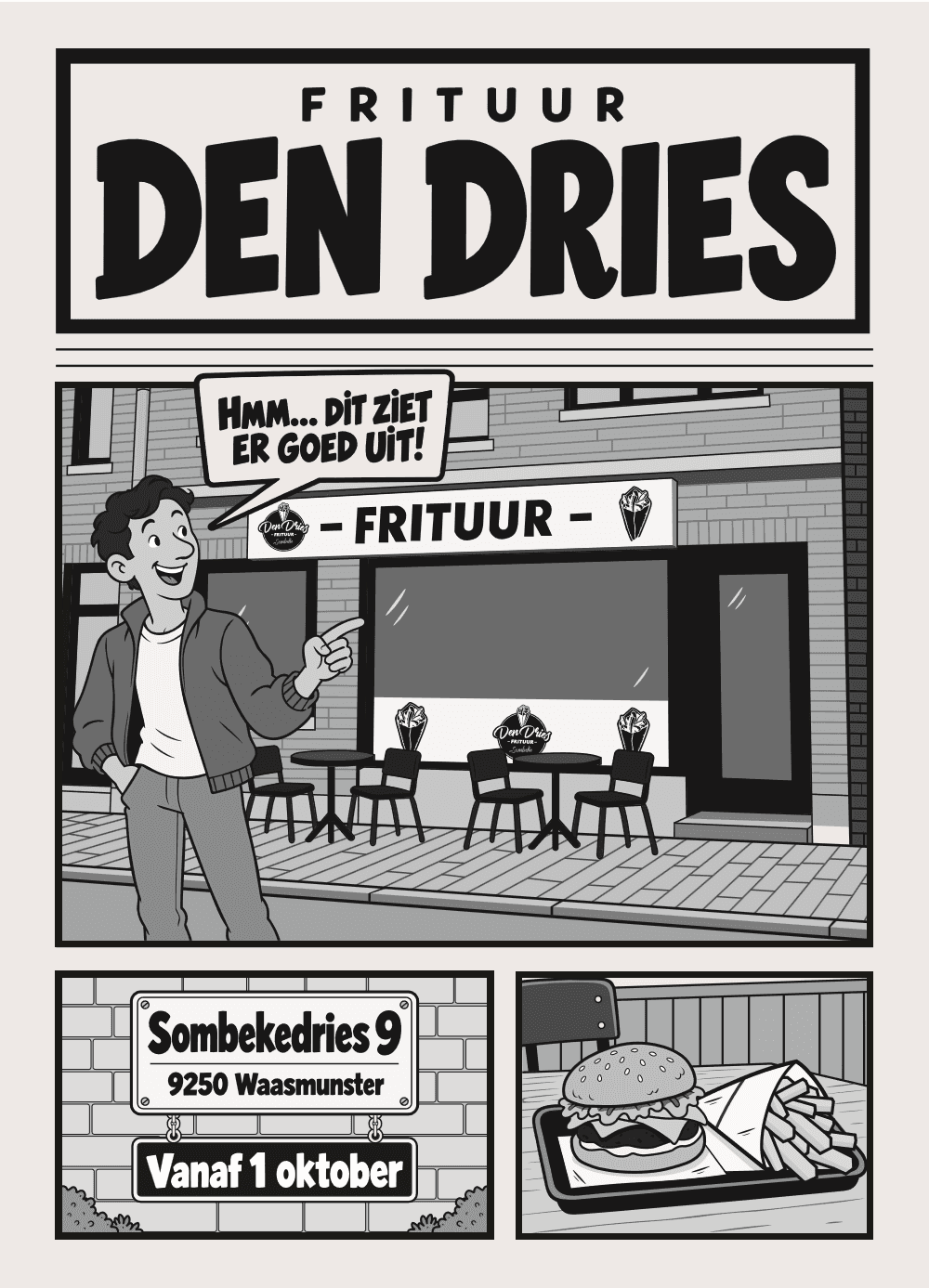
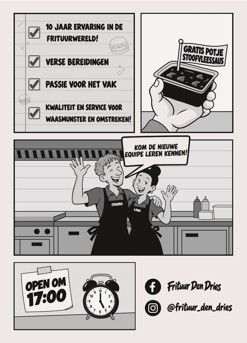
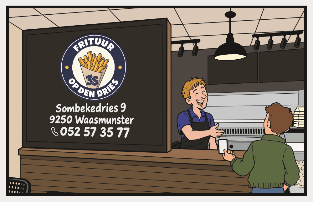
The opening flyer, still under the original name, uses a black-and-white comic to introduce the new team. In the later colour poster, Charro and Lana spot a crowd outside and invite them to order by scanning a QR code. The loyalty card tells another small story at the counter and uses the round logo for its stamp spaces.